A modern personal work area
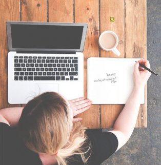
We're looking for a hero image of an overhead view of a modern personal work station that includes a desk, laptop, personal items and a person.
We love the beauty and character of the shots on this site and want you to explore ways to make this photo unique, but there are a few detailed requirements:
1. The shot must be an overhead shot directly over the person, laptop & desk
2. The laptop screen should be clearly visible, tilted as much as reasonable for actual use (we WILL be placing a screen shot on it, and it's important for that screen shot to be visible)
3. The desk / table should be modern and unique. Also, it should fit placement in the home, office or outdoors (we will set the overhead photo against completely different floor samples as part of the messaging)
4. The person at the desk should be ~20-30 yo, well groomed, hip and dressed ambiguously for home, work or outdoor (e.g., black t-shirts work well to make the setting ambiguous; avoid specific attire like a tie). Ideally their hands are engaged with the things on the desk to some degree (i.e., on keyboard, pen in hand, etc.)
5. The desk items should feel very unique. Use at least the following: coffee, a notebook - with some writing, preferably a to-do list or appointment schedule, and 1-2 other personal items (i.e., headphones, cell phone, glasses). Also, they should NOT be sloppy, but not perfectly organized either. Neat, but natural.
Nice to haves:
6. We'll be using different floor cuts to place this desk on, so it would be helpful to have some small gap between the person and desk that shows the floor, so it looks more natural when it's replaced
7. A wide angle shot is always helpful because then we can choose how to crop it
8. If the laptop screen is not viewable from above, we will also consider a tablet laid flat on the table or in the person's hands in its place
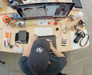
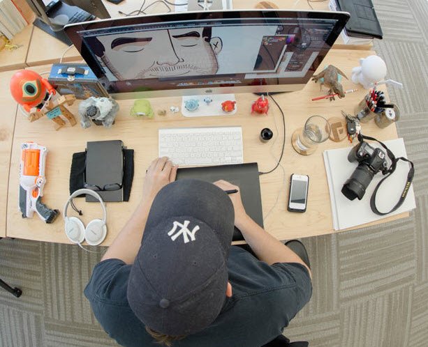
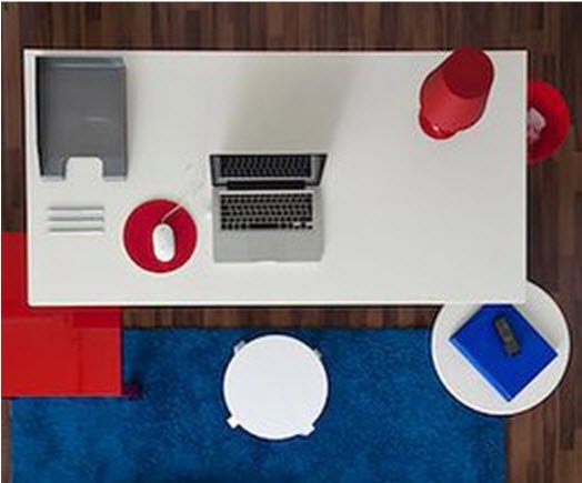
We're looking for shots similar to (but much higher quality than) those included. None met the feel of the website we're looking for, which is like the style of frankandoak.com, warbyparker.com, harrys.com, djones.com and gilt.com to name a few. If it's helpful, we can also provide mock-ups of the webpage where it will be used so you can match the feel of the rest of the site.
日本語はこちら:http://goo.gl/wkTeM6


Messages posted by users